Developer Spotlight - The Command Interface
Dear players,
In developer spotlight posts, we discuss the detail and ideas behind Carrier Command 2.
In this post, we want to tell you about how you interface with the various carrier systems, command strategy, and directly control the unmanned vehicles.
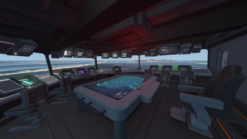
You interact with these systems using (diegetic) physical screens, buttons, switches, and control seats. These physical controls are arranged in stations, where the tools, actions and controls for a specific point in the game are at hand. Overlaid user interface is kept to the minimum.
In Carrier Command 2, we want the carrier bridge to be a rich world where every screen, button, switch and dial has a function and does something in the world. There are no cosmetic buttons and controls, no false doors.
The Screens
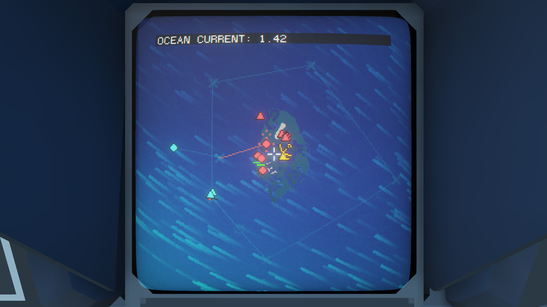
Complex interactions and data are handled by in-game screens. These include displaying map data, setting vehicle orders, listing inventory and system status, and more. These screens are modelled after CRT military and marine screens commonly found in navy ships produced during the cold war, and were the basis for the vision of science fiction of that era.
These screens are placed at stations, and multiple screens are often accessed from a single station. Many screens are most commonly used passively, where the player has vision of the screen, without it taking the focus of the players view.
The screens are low-resolution analogue screens, to reflect the interfaces and style of the original game, and pay tribute to this era of technology. In practical terms, this also works really well because you can still read all information when stood back from the screen. At this scale, information is minimal and can be displayed in a simple to understand way.
Literalism
In Carrier Command 2, placing the player in the narrative of the world, and making it feel relevant and authentic is extremely important to us. For this reason we wanted to avoid overlaid UI as much as possible. Diegetic UI helps set the mechanics and rules of the world, and makes it easier for the player to understand what tools are at their disposal and where these tools are.
This literalism is a newer concept in game design, with our favorite early uses being Tim Schafers in Grim Fandango and later the epic controller and interface of Steel Battalion.
Flow of Gameplay
We have arranged the carrier bridge into gameplay stations, to give the player the controls and functions they need at any point in that gameplay cycle. This minimizes the break in flow as a player walks between stations, if for just a couple of meters. In the middle of battle, it would feel obstructive to repeatedly move between screens, when quick decisions and actions are necessary. By grouping controls and interfaces by mode of gameplay, gameplay can flow without cluttering the interface with functions not required at that point in the game.
These game design decisions and directions are really important to us and we would love to hear what you think! We look forward to reading your feedback in the comments :-)
Much love <3,
The Carrier Command Developers
Link to the original post: https://store.steampowered.com/news/app/1489630/view/2934623681408672062?l=english