
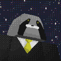
i am glad you are listening to the community. @Pac i just have a small question since the changes, you used to be a profile background that was a 8bit day cycle and changed depending on the time of day, is that anywhere now or is it completely gone
example of what i mean https://imgur.com/gallery/VZ9H2


Would it be possible to bring back the option of changing the background when editing the theme of the series page? For the Sonic series we both used background and foreground and when changing the theme colour to bring back the old background it doesn't look right anymore.

Ultra-minor one, page title (and twitter description) for runs duplicate the runners names e.g.:

@The-mad-king That's the @Milk theme. The functionality is still there, but with the pre-made themes that you can browse the site with gone (now your profile themes covers that), I'm not sure where to put it in.
@flyingfox Yeah series themes will be coming back. I just forgot this morning.

I think transparencies should only be allowed at 80% if at all... and only available if there's a background image. Maybe just make it a toggle switch?
Some of the custom themes for games were truly horrid and I appreciate all the work you've done to make the site look more unified. A few more tweaks and I think we'll have something much better than the previous site.
Wonderful job on the new update. Looks crisp and clean! Keep it up!
A few bonus things:
- splits.io gold splits are not highlighted gold any more.
- Wondering why this link was removed from "More": https://www.speedrun.com/changelog
- So, so excited to see what y'all do with graphs :)

Thanks for rolling back some of the changes. It would be great if we could customize the fill and outline colors of the leaderboards and navbar like before; the unchangeable dark gray really doesn't go with the background and logo we had before. As for transparency, bring it back, but don't allow it to be less than 70% or 80%. And it would be nice but not necessary to have the background and foreground positioning back (but not scrolling); around the holidays I liked to add a repeating tessellated snow gif to the foreground of the leaderboards I mod

Options for scrolling/transparency/foreground/background position should be returned

if themes look bad on light mode why not give games the ability to define a theme for both light and dark mode respectively
like I said in the other thread, I think customization is an aspect you should be expanding on, not cutting back. The high traffic pages will put the effort in. The people with no sense of colour theory will not, but nothing you can ever do will help such people.
Also, while rolling back some of the changes is enough to please some. I'm still curious what compelled this change at all

re:point #4, why does it matter if certain lbs look bad? My understanding was that src is hands-off and lets communities do what they want.
The changes definitely look a bit better than the original version of the overhaul. However, there are still some things as well that could use some tweaking. For the games with the custom backgrounds, the solid board color really makes some of the backgrounds not matter at all. Perhaps making it not as opaque would make it look better for said games. Also, for games with multiple categories on the main boards, putting the board's background behind the category text and perhaps lightening it behind the other categories could work. Also also, for account names, with the green bar, my purple name looks nearly illegible on either mode. That might be solvable by a thick drop shadow though. Edit: Seems to be on more than just the green bar up top in terms of the name
it's hands off when they have to make actually difficult decisions regarding content enforcement but if your colours look like crap then lol all hands in
I don't know if this is a bug or not, but this panel in a Guides pages that has no guides is green regardless of the theme colour:

Something I would suggest is having some kind of tab always present behind the categories you don't have selected on a leaderboard. Even with good custom backgrounds and otherwise solid colour choices, you end up with situations like this:

Next year Twitch removes all stream layouts.. wait, that wouldn't be that bad tbh Pac, blink twice if you're in trouble. Did somebody on here hurt you? But fr, opaque monochromatic boxes kinda kill the point of a background. It was nice matching the panel colour to the background, adding transparency, making all the text look nice with it. Probably reconfigured all that about half a dozen times / year. Some things are definitely nicer UI-wise (ex. submitting a run) but appearance-wise it's not going in the right direction, even with the re-added backgrounds and logos, it just does not look good.

the late stage capitalism of someone taking away features, bringing them back in some botched form, and people praise you for it
at least some people will always see past it

"Do people also want the background positioning / scrolling / foreground options back?" Yes! I loved it when people used it in a creative way. Best example I have in mind was the old Yoshi's Island theme. I also thought of ideas of how to potentially implement that into some themes of games I moderate. And of course the transparency option is really needed again :P Thank you for listening Pac!
[quote] [/quote]Fixed.
[quote]
 [/quote]Fixed.
Also, I think I fixed the marathon run submission glitch mentioned previously, if it's still not working please let me know.