Hey, I really like making leaderboard layouts, and have made many well-received ones before. (check Freedom Planet, Jazz Jackrabbit 2 and Grapple Force Rena for examples).
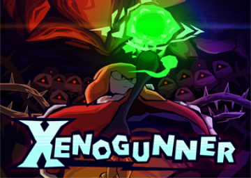
Anyways, my idea is to make the background ripped assets from the menu. The dev has kindly provided these, I just added working transparency for the one in-front.
BACKGROUND:

Click advanced, set background to center and repeat to both. Check enable foreground.
FOREGROUND:

Click advanced, add movement speed, set to slow. Foreground position set to center. Tiling must be set to both.
As for layout colours. Maybe the text can be a pale whitish-blue, akin to the title text? I'll leave it at that for now.

ahh I just applied it and I think it looks really rad <3 thank you so much for this! I really appreciate it! let me know if you think any adjustments should be made or if I should add something!
Looks pretty good, but something looks off about it;
-
The foreground stars seem to have been set to fill the screen, rather than tile making it look blurry and blown up. Uncheck fit to screen, it's meant for hi-res images - this one is anything but.
-
It seems the background was set to move, rather than the foreground.
You can use the in-game menu space background as a reference, that's what my idea is based off of.
huh, that's weird...
I actually already have had the foreground not set to fill the screen, and the foreground is the one that's moving for me! I have to wonder if it's bugging out on your side for some reason then O: that or it's just really easy to confuse the two and you may have been mistaken, which I don't blame you at all for!
I did however have the background set to fill the screen, I just now turned that off and I think it looks a lot less blurry and nicer now! (that might have been what you meant to say anyways!)
again thank you so much for this! <3 it is very cool!
After reviewing the content from the provided URL, it seems like there was a discussion about a game theme proposal for Xenogunner on the speedrun.com forums. The proposal involved creating a leaderboard layout with ripped assets from the game's menu as the background, along with adjustments to the foreground and layout colors. There was positive feedback from participants, with suggestions for improvements and adjustments to make the design more visually appealing. The conversation revolved around fine-tuning the elements, such as good night images the movement speed of the foreground, tiling, and the use of the in-game menu space background as a reference. Overall, the participants appreciated the effort and creativity put into the proposed design. It's fantastic to see the community engaging in discussions and collaborating to enhance the gaming experience. Your involvement in the conversation shows your dedication and passion for the game. Keep up the great work and continue to contribute your ideas and expertise to the community!

