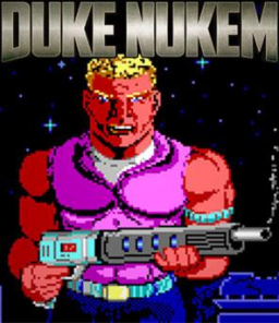
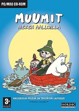
unrelated to the thread but why did this new src update make you download the images when you try to open them in a new tab?????
what is the reason to limit the number of users you can follow? like whats the point?
copy paste + edit from my thoughts thread
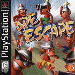
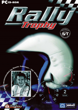
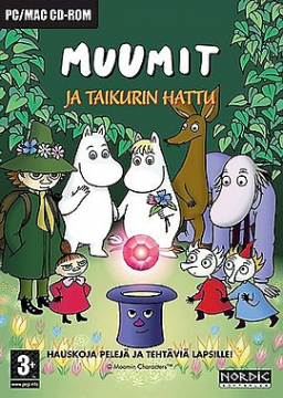
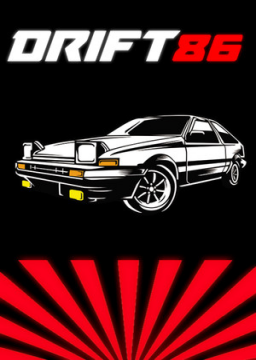
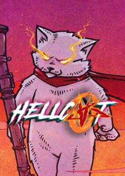
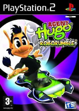
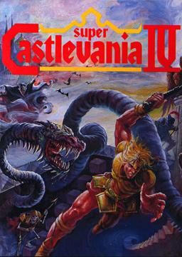
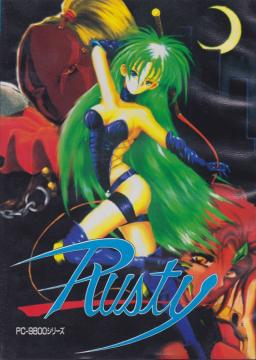
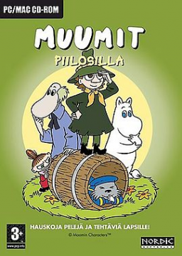
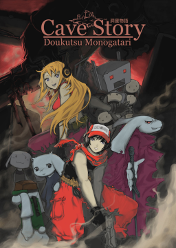
-i get wanting to make the game covers be the same size but it looks super dumb if the picture isnt in the aspect ratio the site wants
-on /forums/ why is the "you didnt give us money" thing so big?
-the theads are hard to read when everything is way more compact
-circle shaped profile pics suck.
-the resources page is now even harder to find for new users. (used to be right under the three dots at the top center) meaning more threads will be made
"where do i download livesplit????"
-why cant you see when a user was last active?
-apparently shift+enter makes a new line on the editor but not onto the actual post everyone sees
-why was the (your)pending runs button removed from the top bar?
-misc categories are maybe too hidden. i first thought they were just gone because i couldnt see the thin few pixel thick arrow
-you now only see the first 13 runs of a category when you open a leaderboard. back when the game info was on the left you could see at least the first 30 runs. the new update made this drop from 20(i think) to 13.
-runs with no run date appear as "never" on the leaderboards for somereason.
-do these platforms really need to be bundled? there is definetly no space for them....

-readable

-why can you no longer open a thread straight to the latest post in it by clicking the time stamp below the username on the very right
-whenever you refresh the page flashes with the default theme
-in the news page it says the new update aritcle has 86 comments yet when you open the actual article and scroll down it will only show 20
bringing the "early access" bug testing method over to websites
-i get wanting to make the game covers be the same size but it looks super dumb if the picture isnt in the aspect ratio the site wants -on /forums/ why is the "you didnt give us money" thing so big? -the theads are hard to read when everything is way more compact -circle shaped profile pics suck. -the resources page is now even harder to find for new users. (used to be right under the three dots at the top center) meaning more threads will be made "where do i download livesplit????" -why cant you see when a user was last active?
-apparently shift+enter makes a new line on the editor but not onto the actual post everyone sees
-why was the (your)pending runs button removed from the top bar?
-misc categories are maybe too hidden. i first thought they were just gone because i couldnt see the thin few pixel thick arrow
-you now only see the first 13 runs of a category when you open a leaderboard. back when the game info was on the left you could see at least the first 30 runs. the new update made this drop from 20(i think) to 13.
-runs with no run date appear as "never" on the leaderboards for somereason.
-do these platforms really need to be bundled? there is definetly no space for them....

-readable

having all game covers be the same size makes sense but it looks so bad if the cover isnt the aspect ratio the site wants.
you can crop the window in obs so it doesnt show the buttons etc. hold ALT while dragging from the corners/sides
