[quote=kacey]my followed games while in a smaller window mode.[/quote]Yeah, the Followed Games list isn't currently visible on mobile, so that's something that will be added soon.


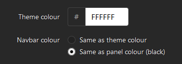
"Yep. It was impossible to make sure any theme colour could work on both Day and Night modes. It worked for some neutral colours like dark blue and green, but not for others like yellow and pink."
Then give us options to make two different themes per page? Goddammit, only because some people with boards belong on r/CrappyDesign doesn't mean the rest of us should be crippled. I think I can claim that my boards looked reasonably well designed, and all of them were legible, which wasn't hard to achieve at all. Honestly the longer I look at this the more I strongly dislike it...

Coming soon™

 10 seconds on new layout, already finding bugs. Unless this was from a previous update.


I wholeheartedly believe this was necessarily unnecessary, and thus my day has been immeasurably ruined within 10 minutes of its inevitable conclusion. Consume revolvers, Apprehend constructions.
Also ngl I kinda hate this green. I don't think it looks good on either light or dark mode. I don't even know how you find a color that doesn't look good with black... Also this green nav bar that makes my name hard to read (thank god it's not green am I right) is kinda... questionable.

Ahh maybe removing features might help the backend. Galaxy brain stuff

The redesign has me thinking, is there any chance for an SRC mobile (iPhone/iPad/Android) app anytime in the near future? It’d make SRC a lot more pleasant to use on mobile and perhaps make verifying runs on the go much more of a possibility. Plus, I think the redesign’s theme lends itself to mobile much more.

I quite like the new layout itself but the removal of custom backgrounds is no bueno. Seconding everyone else asking that you reconsider this element of the redesign in the future in some form, if you're that concerned about crappy backgrounds existing there's a better solution than "Nobody gets them".

Edit theme > do this to make things look ok

This was completely unnecessary; the site looked fine, and now it's horrible. GJ

Great... now all pages can look the same. Welcome comrade to our communist utopia.

I personally thought the light mode + green theme and navbar were hideous. I now use night mode (including navbar color) and a white theme color, which looks a lot better. Still, I find it quite bland compared to how it was before. I felt the custom themes and backgrounds were appealing and made the site a lot more interesting. I feel that it would've been better to give people the option of disabling custom backgrounds rather than forcing it on everyone by removing them all. Other than that, I'm indifferent towards this update. The text layout will take some getting used to, but that's just how updates are.
I'm not aware of all the challenges required to make these changes or every single thing that still needs to be fixed. These are just my initial thoughts.


On a games list, like a series page or all games, the "or and" box doesn't read very well. I know what it does because I've played around with it before, but I've had to explain it's function a fair amount when it was the slider, and this change only makes it appear more confusing.

"soMe bAcKGrOunD LoOk bAD, sO No MOre bACkgRoUnD"