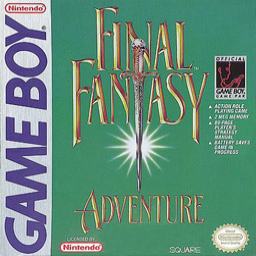

Hi, I'm posting here to ask if it's possible to have the boxart image changed to bring this game's page more in line with the rest of the series? The idea is changing the box art on the game to just the game's logo, for example this image: http://imgur.com/dkyqxCE By having every game in the series be consistent in this way it makes the series page look more coherent, and it makes it easier for people to find a specific game they're looking for, since the logos are more recognisable and readable than box arts in many cases. MLSTRM

I personally think the box art is better, with its green background and everything. The white background is less legible looks less in line with this site's game logos for the rest of the series.
I'm not opposed to swapping out the box art for something else, but that particular one doesn't look like an improvement to me.
Fair enough, it was just an example. Would something along these lines (similar to the legend games) work better in your opinion? ( ![]() - this is a raw image not in the correct aspect ration for srcom at the moment, just gathering ideas.) There also seems to be a monochrome version which I assume is from the title screen when its played on a Gameboy. I'm also happy to collaborate with any ideas you have.
- this is a raw image not in the correct aspect ration for srcom at the moment, just gathering ideas.) There also seems to be a monochrome version which I assume is from the title screen when its played on a Gameboy. I'm also happy to collaborate with any ideas you have.