Hey everyone,
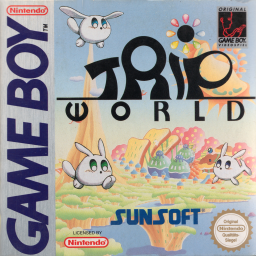
I just recently started running this game to prepare for the upcoming marathon Tiny Ten Remix: www.gbrunners.com/tiny-ten-remix
And as I've done with other speedrun websites, I wanted to give a hand in making it look preety.
Here's the album with all the images: www.imgur.com/a/LWSLT
Hope it's helpfull! 

Thank you so much for using the works I made! Though I notice I failed to make the background that was chosen to loop horizontally
I fixed them, they are in this link https://imgur.com/a/k5slO
One thin I notice is that the "Speedrun.com" logo was not used, is there something I should change or that isn't good about it? Let me know, I can easily edit them :)

Thank you for replying, I've thicken the white outline and the underline, hopefully this one looks better

What about the background tho, does it need any changes?

The white stroke still shows up too thin for me. I suggest removing the stroke and making the black text white.
Not that it matters too much though...

I added it. Yes, I like this better. Thank you! But does everyone think the same?
If not, maybe we need a strawpoll.