
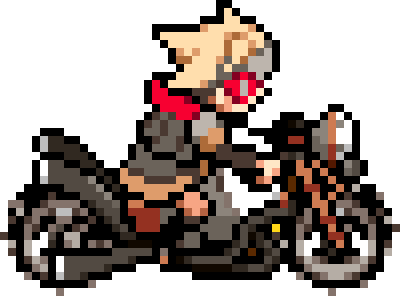
For quite some time I like to try my hands on designing small icons and other stuff. Recently I was interesting in trying to design speedrun.com logos in some of my games. (And designing interesting leaderboards themes in general).
I went through some games on the site, most have the default logo or a simple one, but I'm really interested in those that capture the theme of the game, or mimic the logo/title design of the game itself.
If you know leaderboards with such logos, I would appreciate having some examples, I want to get more ideas or inspiration.
Examples of some logos I made for games that I moderate:


Examples of other leaderboards with interesting logos: https://www.speedrun.com/goiwbf https://www.speedrun.com/ting https://www.speedrun.com/rac1 https://www.speedrun.com/celeste https://www.speedrun.com/hollowknight

similar to game cover: https://www.speedrun.com/ffx
similar to/uses the game font https://www.speedrun.com/gwf https://www.speedrun.com/albion_online https://www.speedrun.com/tsiiyh https://www.speedrun.com/marblemarcher

https://www.speedrun.com/outlast2 https://www.speedrun.com/smw
I quite like these 2

You can also customize your own profile's theme. Could be a good way to express yourself, such as I like to keep things simple. https://www.speedrun.com/user/zopney
I usually make logos with WhatTheFont. After uploading a photo of text from the game/cover, I try to find the best font. If I find a good match then I change the output to "speedrun.com", copy the result into a photo editor, invert the colors (since the theme is usually dark) and make any finishing touches.
https://www.speedrun.com/aft https://www.speedrun.com/flow_series https://www.speedrun.com/wog

https://www.speedrun.com/despicable_me_the_game heres one that is definetly not allowed
https://www.speedrun.com/initial_d_series
Pretty simple, but the idea was to do something similar to the english logo (same as the one you can see for the serie, except that "Initial" replaces the kanjis)

https://www.speedrun.com/slime_rancher
@tyhill111 made this wonderful logo
I took an image from an ingame-item to use it as the "speedrun-trophy" and the orange-red font-colors should remind of the cover-style.
 https://www.speedrun.com/zeliard


Are these not visible on mobile? I clicked a bunch of the links in this thread and didn’t see anything.

@Oreo321 thanks for posting this, you got me excited about it and I went and made a logo for https://www.speedrun.com/bushs_bean_dash Any ideas on how to make the logo bigger? This logo appears really small on the page ://

And actually, my preference would be to include the Bush's Best at the top, but that makes it even smaller ://///

(please help)
@Oxknifer I'm on mobile right now and I don't remember the exact numbers.
On desktop you can activate developer-tools of the browser, and check the speedrun.com logo (any logo on any page). You will see the intrinsic dimension of the logo (size of the uploaded image), and true dimension of the logo after the site applies CSS rules. The final logo will always have the same MAX height and MAX width, and you should account for them when designing your logo.
In your case, I would recommend to remove the banner and keep only the letters; Its height is very high compared to the letters, and it takes precious height from them. The second version takes even more space, and the top text seems unnecessary in my opinion. Another way to fix that is to design a background that will have approximately the same height as the letters inside.