
Hi,
I have noticed that for the category extensions the red cover is just put upside down. I also noticed this in other Gens. There is an unused thumbnail that might look much better:
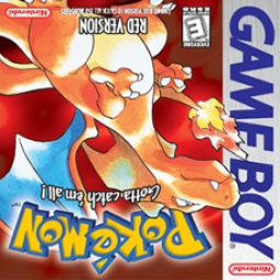
Pokemon Blue Cover
I have noticed that runners, who have done category extensions and the regular run in red and yellow, have 3 pictures in their src profile. And in my opinion it looks aesthetically less pleasing to have the regular yellow cover, the regular red cover and then the upside down red cover. The blue cover is unused and it would look much better if there were 3 different thumbnails:
pokemon yellow cover - yellow speedruns pokemon red cover - pokemon r/b speedruns pokemon blue cover - r/b/y extensions
The thumbnail for the regular red and blue speedruns is the red cover, and this makes sense because nidoking is obtained more easily in red compared to blue.
But for the category extensions I find the blue cover to be a better fit: Blastoise used to be the fastest, is the fastest starter and it is the fastest alt pokemon run on the category extensions.
Besides, people will understand that it is a different page than the red cover because the title Category Extensions is always clearly stated, so people wont get confused if you dont use an upside down picture.
The thing is that the upside down red cover looks like a lazy option and it lets the blue cover go unused while it would actually look and work better.
So my question is: good this simple change be made?
And if there are real objections to this I would also love to hear why??
PS: in other gens this could also be the case example: gold/silver