
I dont know how good it is, to be honest I think that everything I make is bad so I'll leave it to you guys to judge, here's the link: https://drive.google.com/drive/folders/1gFgSGOXoDT9jag8AMOaxr_aP0X29gPI4?usp=sharing


Its a good idea. I will look at how such things are changed and see if they look good later. I will add them, get screen captures, change it back, and people can vote if they think it looks good. Honestly I hadn't ever considered changing the art.

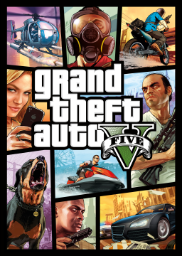
I think they look pretty cool actually. If you could make the colored in V one a little more precise with the coloring so that its not overlapping with some of the outline of it, I think that would be cool. On the other hand, if you can combine the first one and the second one that way you have the outline of the V colored and the five part colored, that would be cool too. One more thing, the 2nd and 3rd place colors look good, but the 1st place seems more yellow than gold, maybe just just pick a darker shade for that. :)

From an outsider looking in and taking both @illuminati7777 's and @Demetrius ' comments about coloring and removing "five". The requested size by the site is 64x64 maximum so here you are:
Gold:

Silver:

Bronze:

As a side note, the site will make it icon size so 16x16 so having "five" would be out of the question when it goes that low.

That's alright since I did go straight to the hex value of Gold on that (#ffd700).
Here's just a few other variants that I went with.
Yellow:

Golden Yellow:

And a brighter Gold I used on my other post:

And this is the part where it would look like Green. To which I have layered over a Grey version of the GTAV logo to put these other colours ontop of.