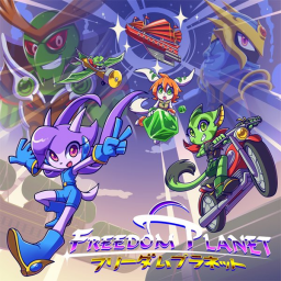
I think the Freedom planet speedrun.com page could do with a bit of visual customisation. Here are two titles I made with the in-game fonts.


EDIT: The first font striked me as too generic and small, so I went with the second one and edited it anyway. See at the bottom.
EDIT 2: Ehh I think this "temporary background" is nice enough to be a permanent one. My deed is done
EDIT: Went and made my polished version of the logo anyway. Much easier on the eyes. Anyone is free to tweak it as they wish.


The logos are good but they need to be transparent before I throw them up there because then I can mess with the colours around the logo and everything else because we're still using the sort of dreary basic grey colour scheme sr.c defaults to.
also i totally forgot we had no background
Cool work, Trey.

Torque's thing is clearly his gun. It's not a source of speed exactly, but that's his gimmick. He has a minor dash ability which brings him to mediocre speed, but he looks cool while he's doing it because of the jet boots. You could also just put Torque there in his shellduck disguise, for humor.
The thing is, he has a lot of different guns. Which gun of his is best for speedrunning overall?
Anyway, I'll add transparency to the logo. I wanted to make sure others were happy with the kerning.
Drawing the background will take a while, as I'm not so experienced with general digital art. No rush though, since the guys technically aren't finished.
EDIT: here's the transparent version.


I think Torque could be hovering
It would also be nice to have a pretty background, perhaps of Fortune Night as all characters play it and it is arguably one of the most liked stages.
As for colour scheme ideas:
Purple, light purple and blue - represents Lilac, the main character of the series.
Primarily blue, with some purple and white - represents the main menu. I'd go with this.
I thought of a temporary background. Know the menu background, right? That would work nicely. It tiles seamlessly.

Also, I don't know if speedrun.com allows you to have a bottom bit of the background (tiling vertically with this thing would look horrible), but if it's possible, it would be this;

Yes, I had to flip it in the middle so it would tile seamlessly. Looks alright, though.
I did the needful. It looks fucking great.
10/10 stuff, Trey.
also is there a reason we don't have you in the speedrunner discord for this game or what? I'll PM you an invite on the freedom planet forums or something because sr.c's messaging system is a myth.
e: you can even make it scroll so I did so it imitates the title screen even closer
PRETTY AS FUCK. GJ GJ
Wow, I switch tabs and get a big suprise with all my changes put in. :o Looks snazzy. Feels like something is missing though. It's probably the lack of animated stars. Can't seem to find the sprites for those though.
I don't have discord, that's why. I'll have to get it sometime, I guess. I know it's free, I just have had no need for it in the past.
I was never completely happy with my logo, so I made some improved versions. Now with hue shifting - the way it was meant to look in the first place.


The bottom one is a bit more true to the original style, but I think the one above looks better.
I like the color palette in the new logos, but I feel the darker band makes them harder to read. I mean obviously it says what it says and nobody will fail to read it, but I still, interpreting the actual words is harder for my eyes at least.